WHY WE CHANGED OUR FACE
By Lendl Tellington
The pace of change in today’s world is rapid. This seemingly constant need to revamp and re-do is becoming more and more ubiquitous. We feel this in our daily lives. When we first launched our website back in September 2011, we had already set our minds on improving our online identity. Instead of jumping the gun, though, we took our time because the changes we’ve made will likely be our last.
Here’s what we learned along the way:
GET OFF THE COMPUTER. GO OUTSIDE.
HyLo Boutiques started on a standard blog format. We had a pretty streamlined look with posts centered on the webpage that dated back chronologically to our very first post:

As we began to develop a visual language for HyLo through photo and video, we noticed a disparity between our content and the site that held it together. Our events have succeeded in reaching an audience of people who continue to visit our gallery. We knew the experience we offer in person had to come across better online. We took a step back and started to look for better ways to translate this experience to the virtual medium.
In January, we took our second trip to the Tamworth Lyceum, Art in the Age’s sister store in New Hampshire. This marked the beginning of a six-month process in which we developed our new website. The Tamworth Lyceum’s expansive art gallery meets artisanal general store inspired us to create new types of visual cues. In this way, HyLo’s new brand was born at the Lyceum.
ARVE Error: no video ID
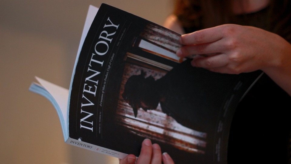
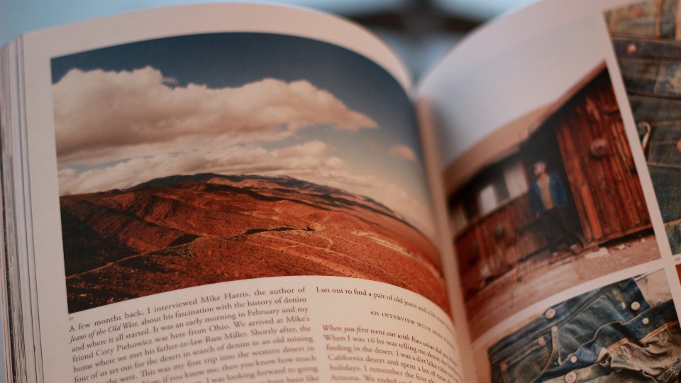
While in Tamworth, our friends at the Lyceum took us on a trip to Portland, Maine. At the Portland Dry Goods Co. boutique, we stumbled upon a magazine called Inventory. Its pages feel like art, and it carries a sense of timelessness that Jen and I strove to achieve in our new branding. Suffice it to say I carried this magazine everywhere I went for the duration of the web development process. When we brought in graphic designer Alyssa Hamilton to develop HyLo’s new identity, we used Inventory as a point of reference. Alyssa has an amazing eye. Through her command of typography, she found balance between the two lettertypes in our new logo as well as the fonts she chose throughout the site.


COLLABORATION IS CRUCIAL TO NEW IDEAS.
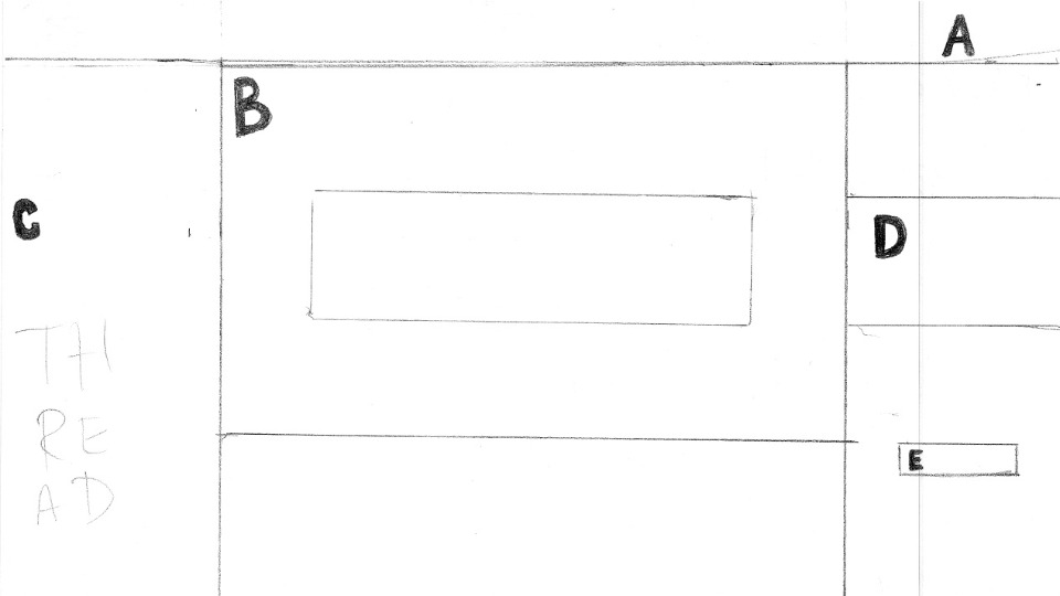
It’s important to note that our site started on paper and not on the computer. Upon our return to Philadelphia, we sketched an arsenal of ideas for potential layouts (see sketches in slideshow). We had to find balance between conventional online navigation language and the physically tangible experience of a great publication.
As Jeff Staple, Creative Director and Founder of Staple Design, says, “Forget making things look pretty. Let’s make things work and make sense.” Taj Reid, a long-time mentor to HyLo, worked with Staple to hash out the design and user experience of his own site wejetset, a sleek online magazine meets travel store. Despite running constant online content with an e-commerce platform, wejetset has seen very minimal changes since its launch five years ago. This is because Taj believes having a well-curated site that works day in and day out is better than seeking out the icing on the cake (think functionality versus flair). These are principles he passed on to us, inspiring our web redesign process from the bottom up.
In fact, the visual pull we hoped to create for our new site already existed right in front of us. The windows of our Rittenhouse lair simulate a cinematic widescreen shot. People stop in their tracks and are instantly engaged. Essentially, looking into our gallery generates a flat image that pulls a viewer into a 3-D experience.
MAKE IT WORK. CREATE A HOME.
We wanted our virtual visitors to have the same sensory reaction—to almost feel the fabrics and taste the treats created by our cadre of hyperlocal merchants. To this end, we had the idea to launch our site in full-screen. There would be an image dominating the entire web browser from left to right. Web designer James Heaney, who has grown HyLo into its online presence since our first incarnation, cautioned us against this for the sake of navigation.
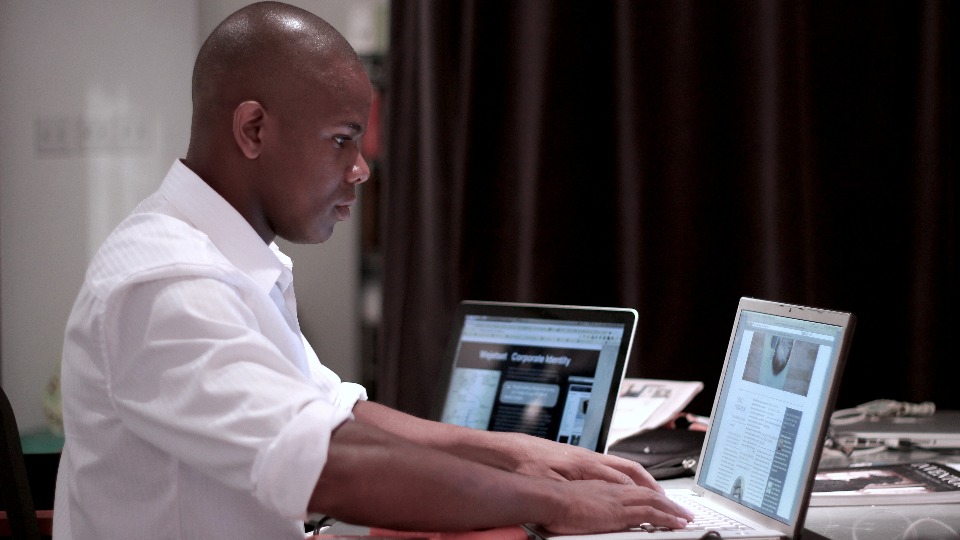
Whenever we have some grandiose idea, James is always the one to ground us. The number of phone calls, texts, and emails that we’ve exchanged is innumerable. James worked with us day in and day out to build our current interface. Now, the site loads large images, some spanning 75% of the browser, which immerse without dominating. In the end, it’s small tweaks like these which make all the difference.

The HyLo you see today is a result of collaboration, exploration, in-person experiences and tons of sketches. James, Alyssa, Jen and I were the primary minds behind the redevelopment, which we supplemented with plenty of research and advice from great friends. The finesse you see was homegrown. With time and discipline, our vision came to fruition.
This website is a platform for hyperlocal happenings. From day one, we desired a tactile feel to showcase the goods produced by our hyperlocal merchants. We strive to make this web experience like visiting a great friend, a loyal tailor, or a favorite restaurant. You’ll come back because you’ve had a good time. You’ll want to repeat that experience again and again. The menu may have a few changes, maybe even a special, but no matter what you’ll always feel at home.

